纯CSS打造现代路径动画:一种新颖的视觉效果
发表时间: 2024-03-06 19:42
在日常开发中,Loading 动画及加载进度应该是使用最广泛的。实现它们的方案很多,包括Gif图、CSS动画、APNG、Lottie等。本文将介绍一种使用 CSS 自定义属性 @property、conic-gradient()、offset-path 以及表情符号实现的路径动画。
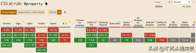
1.1.@property
引用 MDN 的定义:
@property CSS at-rule是CSS Houdini API 的一部分,它允许开发者显式地定义他们的CSS 自定义属性, 允许进行属性类型检查、设定默认值以及定义该自定义属性是否可以被继承。
@property 规则提供了一个直接在样式表中注册自定义属性的方式,而无需运行任何 JS 代码。有效的 @property 规则会注册一个自定义属性,就像 CSS.registerProperty (en-US) 函数被使用同样的参数调用了一样。
基础语法:
@property --property-name { syntax: "<color>"; inherits: false; initial-value: #c0ffee;}浏览器兼容性:
1.2.conic-gradient()
conic-gradient() 创建一个由渐变组成的图像,渐变的颜色围绕一个中心点旋转(而不是从中心辐射)进行过渡。锥形渐变的例子包括饼图和色轮 (en-US)
conic-gradient() 即锥形渐变,它由起始角度、中心位置、角渐变断点三个部分组成,其中起始角度和中心位置都是可以省略的。
基础语法:
conic-gradient( [ from <angle> ]? [ at <position> ]?, <angular-color-stop-list> )浏览器兼容性:
conic-gradient() 已经被所有现代浏览器所支持。

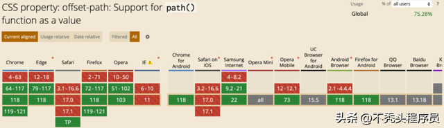
1.3.offset-path
offset 常见属性:
path 的路径参数:
M = movetoL = linetoH = horizontal linetoV = vertical linetoC = curvetoS = smooth curvetoQ = quadratic Bézier curveT = smooth quadratic Bézier curvetoA = elliptical ArcZ = closepath浏览器兼容性:
offset: path() 也已被所有现代浏览器所支持。
2.1.创建页面框架
使用 html:5 和 div.circle>div.indicator 快速创建页面框架。
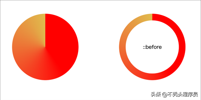
2.2.增加基础样式
使用 conic-gradient() 增加背景色,使用伪元素 ::before 增加了圆环效果,同时给 .indicator 元素增加了 offset 路径,并设置 --size: min-content 以适应内容大小。
:root { --size: 200px; --p: 10%;}@property --p { syntax: '<percentage>'; inherits: false; initial-value: 10%;}body { display: grid; place-items: center;}.circle { position: relative; width: var(--size); aspect-ratio: 1; border-radius: 50%; background: conic-gradient( red calc(-60% + var(--p)), rgb(224, 187, 77) var(--p), #eee 0); cursor: progress; .indicator { --size: min-content; width: var(--size); aspect-ratio: 1; offset: path("M 100,0 a 100 100 0 1 1 -.1 0 z"); offset-distance: var(--p); font: 43pt serif; transform: rotateY(180deg) translateX(-6px); } &::before { position: absolute; inset: 20px; content: '::before'; text-align: center; line-height: 160px; border-radius: inherit; background: #fff; }}效果如下:
2.3.增加动画样式
动画实现主要依赖 --p 属性的变化,记得使用 @property 来定义。
.circle { animation: offsetDis 2s linear infinite; .indicator { animation: offsetDis 2s linear infinite; }}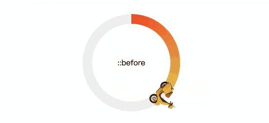
声明:本站内容部分源于网络转载,出于传递更多信息之目的,并不意味着赞同其观点或证实其描述。文章内容仅供参考,请咨询相关专业人士。
如果无意之中侵犯了您的版权,或有意见、反馈或投诉等情况, 请联系本站,[qq:]
Copyright ©2024 编程密语 All rights reserved 版权所有 鲁ICP备09004228号-12
 鲁公网安备37020202000738号