前端开发实战:使用Tailwind CSS构建页面
发表时间: 2024-05-11 10:17
pnpm create vite // 选择 vue typescriptpnpm add -D tailwindcss postcss autoprefixerpnpm tailwindcss init -pexport default { content: [ "./index.html", "./src/**/*.{vue,js,ts,jsx,tsx}", ], theme: { extend: {}, }, plugins: [],}@tailwind base;@tailwind components;@tailwind utilities;<template> <div class="w-full h-16 bg-red-200"></div></template>pnpm run dev 以我们团队设计稿为例, 以 750px 为最大宽度 ,长度,字体的单位都是 px 。为了适配设计稿,我们需要实现一些类来匹配。
比如 w-100 对应 width: 100px ; h-200 对应 height: 200px ; text-24 对应 font-szie: 24px ;
类似的还有 top right botton left border-radius 等, 长度需要覆盖2倍宽度 750*2=1500 , 字体需要覆盖 12-100 , 边框弧度需要覆盖 750/2=375。
除了长度,字体大小,还有颜色,字体类型(font-family)等
以下是 tailwind.config.js 配置 , 其中 颜色,字体 还有其他的需要根据团队视觉规范,项目要求,继续丰富。
注意:这里在 theme.extends配置,属于扩展
如果直接在 theme 中直接配置,虽然有同样效果,但是属于替换,覆盖 tailwindcss 自带的类名,不建议。
/** @type {import('tailwindcss').Config} */const maxWidth = 750const spacing = {};for (let i = 0; i <= maxWidth; i++) { spacing[i] = `${i}px`;}const fontSize = {}for (let i = 12; i <= 100; i++) { // 这里同时设置了1.2倍的行高 fontSize[i] = [`${i}px`, `${i*1.2}px`];}const borderRadius = {}for (let i = 1; i <= 750/2; i++) { // 这里同时设置了1.2倍的行高 borderRadius[i] = `${i}px`;}export default { content: [ "./index.html", "./src/**/*.{vue,js,ts,jsx,tsx}", ], theme: { extend: { // 适用 padding, margin, width, height, min-xxx ,max-xxx等 spacing, // 适用 font-size fontSize, // 适用 border-radius borderRadius, // 适用 color, background-color, border-color colors: { // 这里的命令明确使用场景,颜色,深浅 grayLight: 'rgba(0, 0, 0, 0.54)', // 通用灰色浅色 bgGrayLight:'#f5f5f5', // 背景灰色浅色 linkBlueLight: '#828DD3', // 超链接蓝色浅色 }, fontFamily: { din: ['DIN'], }, }, }, plugins: [],}写了一个简单活动的框架
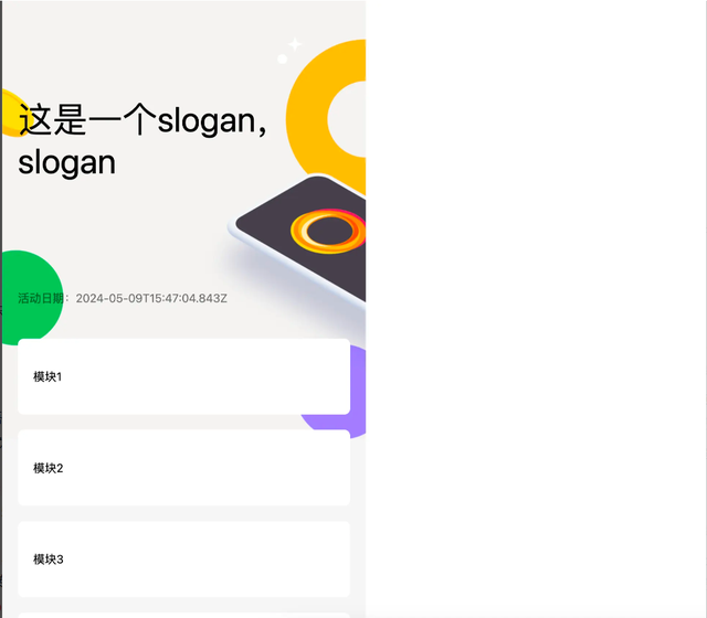
<template> <div class="w-full bg-bgGrayLight pb-16 min-h-screen"> <div class="relative w-full h-453 -mb-120 bg-no-repeat bg-cover bg-[url('./assets/headerBg.jpg')]"> <div class="absolute w-300 top-100 left-16 text-36"> 这是一个slogan,slogan </div> <p class="absolute top-300 left-16 text-12 text-grayLight">活动日期:{{ new Date().toISOString() }}</p> </div> <div class="relative mx-16 mt-16 px-16 py-32 bg-white rounded-6">模块1</div> <div class="relative mx-16 mt-16 px-16 py-32 bg-white rounded-6">模块2</div> <div class="relative mx-16 mt-16 px-16 py-32 bg-white rounded-6">模块3</div> <div class="relative mx-16 mt-16 px-16 py-32 bg-white rounded-6">模块4</div> </div></template>
虽然实现了一个简单的活动,但是有个问题,就是长度,字体等单位是设计稿的一半,需要每次把设计稿中数字除以2,在来编写 css 类名,很麻烦。
同时为了兼容手机屏幕尺寸,采用 rem 单位来替代 px 。 为了方便,我们将设计稿的宽度750px设置为 10rem , 对应的 1rem 就是 75px。
这里需要引入一个postcss插件 postcss-plugin-px2rem
pnpm add -D postcss-plugin-px2rem// postcss.config.js 中添加 postcss-plugin-px2rem 配置 rootValue: 75plugins: { tailwindcss: {}, autoprefixer: {}, 'postcss-plugin-px2rem':{ rootValue: 75 }},设置完了之后,需要吧之前的代码中的 css 类名,乘以 2 ,保持跟设计稿同步,比如:背景头图高度是 906px 那么设置类名 h-906 即可,如下
<template> <div class="w-full bg-bgGrayLight pb-32 min-h-screen"> <div class="relative w-full h-906 -mb-240 bg-no-repeat bg-cover bg-[url('./assets/headerBg.jpg')]"> <div class="absolute w-600 top-200 left-32 text-72"> 这是一个slogan,slogan </div> <p class="absolute top-600 left-32 text-24 text-grayLight">活动日期:{{ new Date().toISOString() }}</p> </div> <div class="relative mx-32 mt-32 px-32 py-64 bg-white rounded-12">模块1</div> <div class="relative mx-32 mt-32 px-32 py-64 bg-white rounded-12">模块2</div> <div class="relative mx-32 mt-32 px-32 py-64 bg-white rounded-12">模块3</div> <div class="relative mx-32 mt-32 px-32 py-64 bg-white rounded-12">模块4</div> </div></template>为了在浏览器上使代码还原设计稿,还需要设置 rem , 需要设置 html 元素的 font-size 属性。 由于 我们把设计稿的宽度定义为 10rem, 那么
document.documentElement.clientWidth == 10rem 那么 font-size的值就是 ${
document.documentElement.clientWidth/10}px
在 main.ts 文件中添加 font-size 属性的设置即可。
const documentElement = window.document.documentElementdocumentElement.style.fontSize = `${documentElement.clientWidth/10}px`window.addEventListener('resize',()=>{ documentElement.style.fontSize = `${documentElement.clientWidth/10}px`})注意: 由于 font-size 会继承 ,在需要展示内容的时候需要明确设置 font-size 属性。
pc 端由于
documentElement.clientWidth 很大,会导致页面变形。 由于市面上 ios android 手机屏幕宽度大概在 320 - 500 之间,这里将最大值设置为500。
也可以通过校验
navigator.userAgent.toLowerCase().includes('mobile') 来判断,在 pc 浏览器下设置 fontSize: 50px。
// 修改之后代码。 const documentElement = window.document.documentElementdocumentElement.style.fontSize = `${Math.min(documentElement.clientWidth,500)/10}px`window.addEventListener('resize',()=>{ documentElement.style.fontSize = `${Math.min(documentElement.clientWidth,500)/10}px`})这里还需要给 body 设置一个宽度 <body class="w-750"> 对应 10rem 作为满屏宽度
上图在pc浏览器显示,右边空白,左边保持一个移动端的正常文档流
如果页面需要在多语言环境运行,在英文环境下,由于英文翻译一般都会比简体长。 我们需要在 英文环境下修改一些元素的宽高,字体等。
这里类似 tailwindcss 的 dark 模式,创造一个 en-GB 模式类适配英文环境。 例如 w-300 en-GB:w-500 在 英文环境下 宽度 500 ,其他宽度 300
在 tailwind.config.js 文件中添加插件函数,通过 addVariant 创建一个变体(variant) en-GB 把所有 en-GB:xxx 类名,转义成 .en-GB .en-GB:xxx 的类选择器。 然后只要在 body 中添加 en-GB 类名即可 <body class="w-750 en-GB">
一般有多语言需求的页面都会在 cookie 种上语言标记,例如 en-GB , 可以通过动态的方式获取,然后添加到 body 的 class 中即可, 但是给每个需要特殊处理的语言,调用addVariant添加变体。
// 配置 tailwind.config.js plugins 函数plugins: [ function ({ addVariant, e }) { addVariant('en-GB', ({ modifySelectors, separator }) => { modifySelectors(({ className }) => { return `.en-GB .${e(`en-GB${separator}${className}`)}`; }); }); },],// 添加 slogan 这里的变体 en-GB:top-300 表明英文环境下定位的 top 值是 300<div class="absolute w-600 top-200 en-GB:top-300 left-32 text-72"> 这是一个slogan,slogan</div>通过 pnpm run build 构建生产版本,找到 css 文件内容 , 编译结果跟我预期一致。
// 插件函数modifySelectors(({ className }) => { return `.en-GB .${e(`en-GB${separator}${className}`)}`;});// 构建结果.en-GB .en-GB\:top-300 { top: 4rem}当然我们也可以根据实际需求,创建其他的变体,比如,id 选择器 #en-GB .en-GB:xxx ; 子代选择器 .en-GB>.en-GB:xxx ;还有其他很多,构建符合自己需求的即可。
声明:本站内容部分源于网络转载,出于传递更多信息之目的,并不意味着赞同其观点或证实其描述。文章内容仅供参考,请咨询相关专业人士。
如果无意之中侵犯了您的版权,或有意见、反馈或投诉等情况, 请联系本站,[qq:]
Copyright ©2024 编程密语 All rights reserved 版权所有 鲁ICP备09004228号-12
 鲁公网安备37020202000738号