提升你的CSS技能:第二部分
发表时间: 2021-06-06 20:46
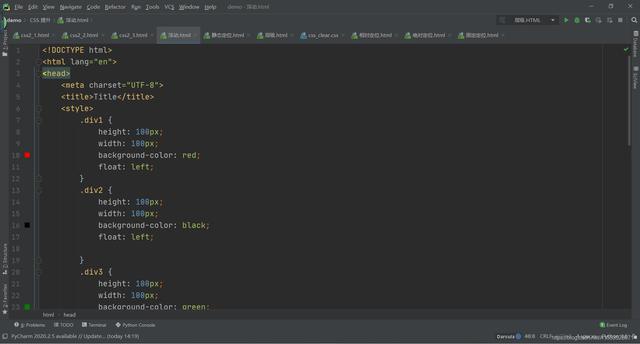
1.边框
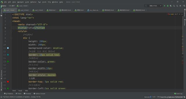
边框有大小和样式后,才会有颜色
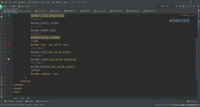
div { height: 200px; width: 200px; background-color: skyblue; /*边框 大小 样式 颜色*/ /*border: 10px solid teal;*/ /*颜色*/ border-color: green; /*大小*/ border-width:10px; /*样式*/ border-style: dashed; /*上边框*/ border-top: 5px solid red; /*左边框*/ border-left:5px solid green; /*有边框*/ border-right:5px solid darkgray; /*下边框*/ border-bottom:5px sol purple;id /*边框弧度*/ border-radius: 20px; }(1)上下左右边框颜色
{ /*上边框*/ border-top: 5px solid red; /*左边框*/ border-left:5px solid green; /*有边框*/ border-right:5px solid darkgray; /*下边框*/ border-bottom:5px solid purple;}(2)边框弧度
边框弧度如果设定为 50% 则是一个圆形
{ /*边框弧度*/ border-radius: 20px;}{ border-radius: 50%;}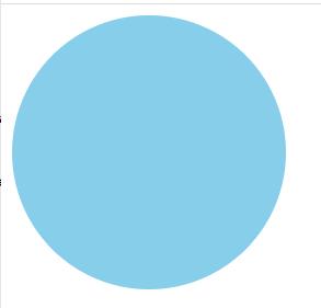
2.内边距(padding)
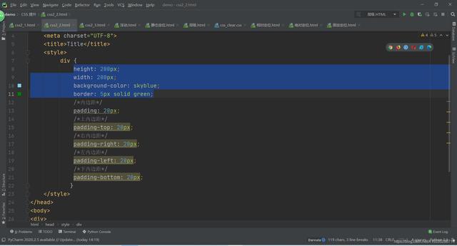
<style> div { height: 200px; width: 200px; background-color: skyblue; border: 5px solid green; /*内边距*/ padding: 20px; /*上内边距*/ padding-top: 20px; /*右内边距*/ padding-right: 20px; /*左内边距*/ padding-left: 20px; /*下内边距*/ padding-bottom: 20px; } </style>如果 padding 后有一个参数,则表示上下左右
如果 padding 后有两个参数,则表示上下,左右
如果 padding 后有三个参数,则表示上,左右,下
如果 padding 后有四个参数,则表示上,右,下,左
3.外边距(margin)
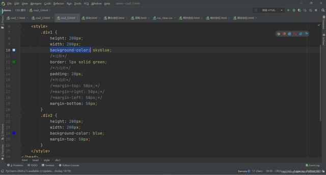
外边距同上,两个盒子的距离取外边框较大的一方
<style> .div1 { height: 200px; width: 200px; background-color: skyblue; /*边框*/ border: 5px solid green; /*内边距*/ padding: 20px; /*外边距*/ margin-top: 50px; margin-right: 50px; margin-left: 50px; margin-bottom: 50px; } </style>浮动,其实就是让元素脱离正常的文档流。当正常文档布局不能解决的时候,则需要脱离正常文档流。
例如,有不同颜色的盒子排列成一行,令其中一个盒子悬浮,就会使排列在它之后的盒子向前移动。而从上帝视角看,移动到悬浮盒子之下的盒子就会被悬浮的盒子遮住,从而看不到下面的盒子。
1.浮动( float )
加上浮动后,盒子由块级元素变为内敛块级元素
(1)向左浮(left)
.div1 { height: 100px; width: 100px; background-color: red; float: left; } .div2 { height: 100px; width: 100px; background-color: black; } .div3 { height: 100px; width: 100px; background-color: green; }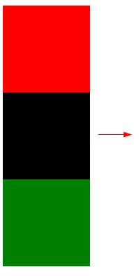
因为第一个盒子浮动,第二个盒子向前进补位,以至于看不到第二个盒子,只能看到第一个和第三个。
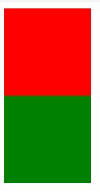
(2)向右浮( right )
.div1 { height: 100px; width: 100px; background-color: red; float: right; } .div2 { height: 100px; width: 100px; background-color: black; float: right; } .div3 { height: 100px; width: 100px; background-color: green; }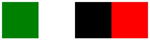
2.浮动坍塌
父元素不设置高度的情况下,靠子元素撑起的高度;当所有子元素都浮动的情况下,子元素脱离文档流,父元素没有高度
3.解决高度坍塌问题
(1)给父元素加高度
但因为给父元素加了高度后,之后再添加元素就会产生限制,所以不可取。
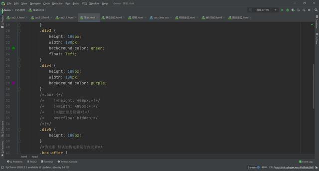
.box { height: 400px; width: 400px; }(2)超出部分隐藏(overflow)
overflow: hidden;(3)加一个空盒子撑起高度
.div5 { height: 100px; }(4)加伪元素
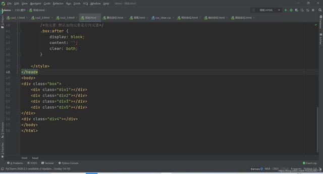
默认伪元素为行内元素
/*伪元素 默认加伪元素是行内元素*/ .box:after { display: block; content: ''; clear: both; }display 是转化为块级元素
content 是测试内容
clear 是清空浮动
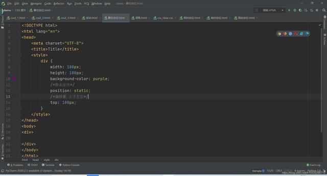
1.静态定位(static)
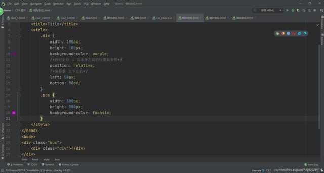
/*静态定位*/ position: static; /*偏移量 上下左右*/ top: 100px;2.相对定位( relative )
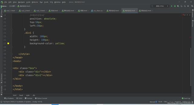
/*相对定位 : 以本身之前的位置做参照*/ position: relative; /*偏移量 上下左右*/ left: 50px; bottom: 50px;3.绝对定位( absolute )
进行绝对定位的元素会脱离文档流
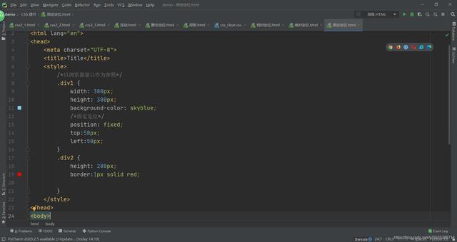
/*绝对定位*/ position: absolute; top:50px; left:30px;4.固定定位( fixed )
元素进行固定定位后,无论别的元素怎么移动,固定定位的元素都不会改变位置。(例如小说页面的小广告)
/*固定定位*/ position: fixed; top:50px; left:50px;当几个盒子重叠时,为盒子设置层级,即可在上层显示。
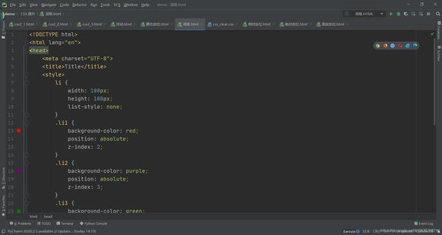
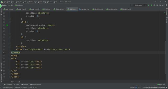
li { width: 100px; height: 100px; list-style: none; } .li1 { background-color: red; position: absolute; z-index: 2; } .li2 { background-color: purple; position: absolute; z-index: 3; } .li3 { background-color: green; position: absolute; z-index: 4; }因为在以上图片中,li3 层级最高,所有会优先显示 li3 盒子。
附(今日份学习):
浮动:
静态定位:
相对定位:
绝对定位:

固定定位:
层级:
声明:本站内容部分源于网络转载,出于传递更多信息之目的,并不意味着赞同其观点或证实其描述。文章内容仅供参考,请咨询相关专业人士。
如果无意之中侵犯了您的版权,或有意见、反馈或投诉等情况, 请联系本站,[qq:]
Copyright ©2024 编程密语 All rights reserved 版权所有 鲁ICP备09004228号-12
 鲁公网安备37020202000738号