探索HTML CSS动画与过渡的奥秘
发表时间: 2024-01-28 20:16
在现代网页设计中,动画和过渡是提升用户体验的重要手段。通过使用 CSS,我们可以在不影响页面性能的前提下,实现平滑和吸引人的视觉效果。本文将介绍 CSS 动画和过渡的基础知识,并通过几个例子展示如何在你的网站中应用它们。
CSS 过渡允许你在 CSS 属性值之间创建平滑的动画效果。当一个元素的属性值改变时,过渡效果会在一定时间内平滑地过渡到新的属性值。
transition: property duration timing-function delay;img:hover { transform: scale(1.2); transition: transform 0.3s ease-in-out;}这个例子中,当鼠标悬停在图片上时,图片会在0.3秒内放大到原来的1.2倍大小,过渡效果为ease-in-out。
CSS 动画提供了更强大的控制,允许你创建复杂的动画序列,通过定义关键帧(keyframes)来控制动画的中间状态。
@keyframes animation-name { from { /* 初始状态 */ } to { /* 结束状态 */ }}或者使用百分比来定义多个关键帧:
@keyframes animation-name { 0% { /* 初始状态 */ } 50% { /* 中间状态 */ } 100% { /* 结束状态 */ }}@keyframes spin { from { transform: rotate(0deg); } to { transform: rotate(360deg); }}.icon-spin { animation: spin 2s linear infinite;}这个例子创建了一个名为spin的动画,使得图标无限期地旋转。
接下来,我们将通过几个实战例子来展示 CSS 动画和过渡的具体应用。
.button { position: relative; overflow: hidden; transition: background-color 0.3s;}.button:after { content: ''; position: absolute; top: 50%; left: 50%; width: 5px; height: 5px; background: rgba(255, 255, 255, 0.7); opacity: 0; border-radius: 100%; transform: scale(1, 1) translate(-50%); transform-origin: 50% 50%;}.button:active:after { width: 300px; height: 300px; opacity: 1; transition: width 0.5s, height 0.5s, opacity 0s 0.5s;}在这个例子中,当按钮被点击时,会产生一个波纹效果,模拟水波纹扩散。
.fade-in { animation: fadeIn 1s ease-in-out;}@keyframes fadeIn { from { opacity: 0; } to { opacity: 1; }}.fade-out { animation: fadeOut 1s ease-in-out;}@keyframes fadeOut { from { opacity: 1; } to { opacity: 0; }}这个例子中定义了两个动画,一个用于元素的淡入,另一个用于元素的淡出。
<!DOCTYPE html><html lang="en"><head><meta charset="UTF-8"><meta name="viewport" content="width=device-width, initial-scale=1.0"><title>CSS Animation and Transition Example</title><style> body { font-family: 'Arial', sans-serif; margin: 0; padding: 0; background: linear-gradient(-45deg, #ee7752, #e73c7e, #23a6d5, #23d5ab); background-size: 400% 400%; animation: gradientBG 15s ease infinite; display: flex; justify-content: center; align-items: center; flex-direction: column; min-height: 100vh; } @keyframes gradientBG { 0% { background-position: 0% 50%; } 50% { background-position: 100% 50%; } 100% { background-position: 0% 50%; } } .logo { font-size: 2em; color: #007bff; margin-bottom: 20px; animation: spin 3s linear infinite; } .scrolling-text { margin: 20px 0; background-color: #333; color: #fff; padding: 10px; white-space: nowrap; overflow: hidden; position: relative; } .scrolling-text p { position: absolute; width: 100%; height: 100%; margin: 0; line-height: 50px; text-align: center; /* Starting position */ transform: translateX(100%); /* Apply animation to this element */ animation: scroll-text 10s linear infinite; } @keyframes scroll-text { 0% { transform: translateX(100%); } 100% { transform: translateX(-100%); } } .interactive-card { background-color: #fff; box-shadow: 0 2px 5px rgba(0, 0, 0, 0.2); padding: 20px; margin: 20px; border-radius: 10px; transition: transform 0.3s ease, box-shadow 0.3s ease; } .interactive-card:hover { transform: translateY(-10px); box-shadow: 0 4px 10px rgba(0, 0, 0, 0.3); } .color-block { width: 100px; height: 100px; background-color: #17a2b8; margin: 20px; border-radius: 50%; transition: background-color 0.5s ease, transform 0.5s ease; } .color-block:hover { background-color: #28a745; transform: rotate(180deg); }</style></head><body><div class="logo"> <i class="fas fa-sync-alt"></i> Animated Logo</div><div class="scrolling-text"> <p>This text scrolls infinitely. Pay attention to how it moves smoothly from right to left.</p></div><div class="interactive-card"> <h3>Interactive Card</h3> <p>Hover over this card to see it move. It's a simple yet effective way to add interactivity to your design.</p></div><div class="color-block"></div></body></html>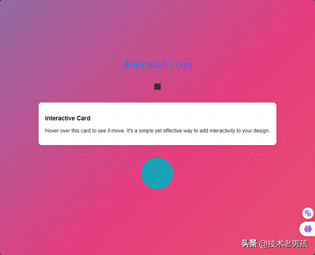
CSS 动画和过渡是前端开发者的强大工具,它们可以在不牺牲性能的情况下为用户提供流畅、引人注目的界面交互。通过掌握这些技术,你可以创造出更加动态和生动的网页体验。记住,动画应该用来增强用户体验,而不是分散用户的注意力,适量而恰当地使用动画效果是关键。
声明:本站内容部分源于网络转载,出于传递更多信息之目的,并不意味着赞同其观点或证实其描述。文章内容仅供参考,请咨询相关专业人士。
如果无意之中侵犯了您的版权,或有意见、反馈或投诉等情况, 请联系本站,[qq:]
Copyright ©2024 编程密语 All rights reserved 版权所有 鲁ICP备09004228号-12
 鲁公网安备37020202000738号