28个CSS布局实例:图文详解
发表时间: 2022-03-14 12:05

布局在我们前端日常开发来说是非常重要的,一个好的布局能简化代码的同时还能提高网页的性能。常见的布局方法有浮动(float)布局、绝对定位(position)布局、表格布局(table)、弹性(flex)布局、网格(grid)布局。关于布局方法本文不做详细讲解,笔者推荐看阮一峰老师 flex布局教程 和阮一峰老师 grid布局教程。
本文主要讲解水平垂直居中、单栏布局、双栏布局、三栏布局一些项目中常用的布局方案。
本文代码全部使用codepen在线代码工具进行演示。
居中在我们日常工作中还是会经常碰到。
对于水平居中一般可以使用如下四种方式
<div class="div1"> <span>行内元素水平居中</span></div><div class="div2"> <span>行内元素水平居中</span> <div>块级元素水平居中</div></div><div class="div3"> <span>行内元素水平居中</span> <div>块级元素水平居中</div></div><div class="div4">块级元素水平居中</div>.div1 { text-align: center;}.div2 { display: flex; justify-content: center;}.div3 { display: grid; justify-content: center;}.div4 { width: 130px; margin: 0 auto;}效果如下

点击查看代码运行实例
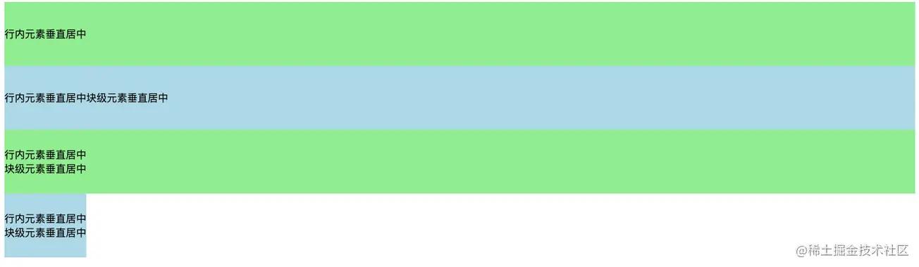
对于垂直居中一般可以使用如下三种方式
<div class="div1"> <span>行内元素垂直居中</span><!-- <div>块级元素垂直居中</div> --></div><div class="div2"> <span>行内元素垂直居中</span> <div>块级元素垂直居中</div></div><div class="div3"> <span>行内元素垂直居中</span> <div>块级元素垂直居中</div></div><div class="div4"> <span>行内元素垂直居中</span> <div>块级元素垂直居中</div></div>.div1 { height: 100px; background: lightgreen; line-height: 100px;}.div2 { height: 100px; background: lightblue; display: flex; align-items: center;}.div3 { height: 100px; background: lightgreen; display: grid; align-content: center;}.div4 { height: 100px; background: lightblue; display: table-cell; vertical-align: middle;}效果如下
点击查看代码运行实例
比如我们想实现如下水平垂直同时居中的效果
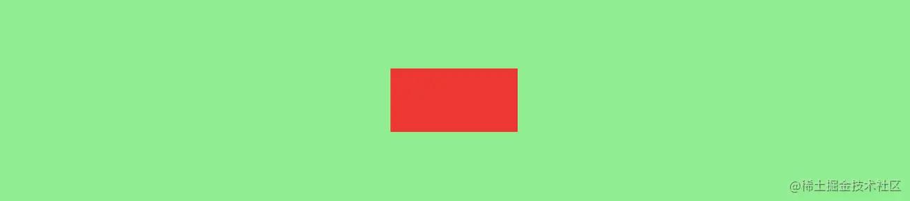
实现水平垂直同时居中我们可以使用绝对定位、table布局、flex布局 或 grid布局来实现。
首先我们创建一个需要居中的盒子。
<div class="box"></div>.box { position: absolute; width: 200px; height: 100px; background: red; top: 0; left: 0; right: 0; bottom: 0; margin: auto;}点击查看代码运行实例
这种方式需要知道居中元素的具体宽高,不然负的margin没法设置。
.box { position: absolute; width: 200px; height: 100px; background: red; left: 50%; top: 50%; margin-left: -100px; margin-top: -50px;}点击查看代码运行实例
这种平移的方式就不需要考虑居中盒子的具体宽高了。
.box { position: absolute; width: 200px; height: 100px; background: red; left: 50%; top: 50%; transform: translate(-50%, -50%);}点击查看代码运行实例
html,body { height: 100%; }body { background: gray; display: flex; align-items: center; justify-content: center;}.box { width: 200px; height: 100px; background: red;}点击查看代码运行实例
html,body { height: 100%; }body { background: gray; display: grid;/* align-content: center; justify-content: center; */ /* align-content和justify-content的简写 */ place-content: center;}.box { width: 200px; height: 100px; background: red;}点击查看代码运行实例
使用table布局需要注意如下
<div class="box"> <div class="child"></div></div>.box { background: red; height: 300px; width: 600px; display: table-cell; vertical-align: middle;}.child { width: 200px; height: 200px; background: lightgreen; margin: 0 auto;}点击查看代码运行实例
单栏布局我们常用在网页框架上,一般我们把网页分为 header、content、footer三部分。
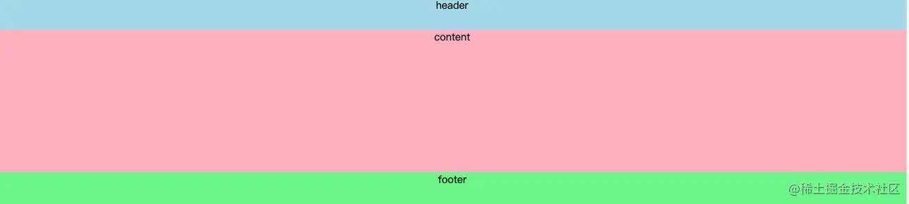
在不同的项目我们可能对这三部分的样式需求有所差别,比如需要顶部固定、需要底部固定等等。
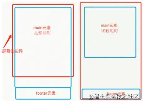
比如想实现如下效果,footer在内容不足的时候吸附在窗口底部,当内容多的时候又可以被抵到窗口下面。
<div class="wrap"> <div class="header">header</div> <div class="content">content</div></div><div class="footer">footer</div>html, body { height: 100%; margin: 0;}.wrap { min-height: 100%; padding-bottom: 50px; overflow: auto; box-sizing: border-box;}.header { height: 50px; background: lightblue;}.content { background: lightpink; /* 这里的高度只是为了模拟内容多少 */ height: 100px; /* height: 1000px; */}.footer { height: 50px; background: lightgreen; margin-top: -50px;}点击查看代码运行实例
<div class="wrap"> <div class="header">header</div> <div class="content">content</div> <div class="footer">footer</div></div>html, body { height: 100%; margin: 0;}.wrap { display: flex; flex-direction: column; min-height: 100%;}.header { height: 50px; background: lightblue;}.content { background: lightpink; /* 这里的高度只是为了模拟内容多少 */ height: 100px; /* height: 1000px; */ flex-grow: 1;}.footer { height: 50px; background: lightgreen;}点击查看代码运行实例
<div class="header">header</div><div class="wrap"> <div class="content">content</div></div><div class="footer">footer</div>html, body { height: 100%; margin: 0;}.header { height: 50px; background: lightblue; position: fixed; width: 100%;}.wrap { min-height: 100%; padding-bottom: 50px; overflow: auto; box-sizing: border-box;}.content { margin-top: 50px; background: lightpink; /* 这里的高度只是为了模拟内容多少 */ height: 100px; /* height: 1000px; */}.footer { height: 50px; background: lightgreen; margin-top: -50px;}点击查看代码运行实例
<div class="wrap"> <div class="header">header</div> <div class="content">content</div> <div class="footer">footer</div></div>html, body { height: 100%; margin: 0;}.wrap { display: flex; min-height: 100%; flex-direction:column;}.header { height: 50px; background: lightblue; position: fixed; width: 100%;}.content { background: lightpink; /* 这里的高度只是为了模拟内容多少 */ /* height: 100px; */ height: 1000px; margin-top: 50px; flex-grow: 1;}.footer { height: 50px; background: lightgreen;}点击查看代码运行实例
<div class="wrap"> <div class="header">header</div> <div class="content">content</div></div><div class="footer">footer</div>html, body { height: 100%; margin: 0;}.wrap { height: 100%; padding-bottom: 50px; overflow: auto; box-sizing: border-box;}.header { height: 50px; background: lightblue;}.content { background: lightpink; height: 100px; height: 1000px;}.footer { height: 50px; background: lightgreen; margin-top: -50px;}点击查看代码运行实例
<div class="wrap"> <div class="header">header</div> <div class="content">content</div> <div class="footer">footer</div></div>html, body { height: 100%; margin: 0;}.wrap { display: flex; min-height: 100%; flex-direction:column;}.header { height: 50px; background: lightblue;}.content { background: lightpink; /* 这里的高度只是为了模拟内容多少 */ /* height: 100px; */ height: 1000px; flex-grow: 1; margin-bottom: 50px;}.footer { height: 50px; background: lightgreen; position: fixed; width: 100%; bottom: 0;}点击查看代码运行实例
<div class="header">header</div><div class="content">content</div><div class="footer">footer</div>复制代码html, body { height: 100%; margin: 0;}.header { height: 50px; background: lightblue; position: fixed; width: 100%;}.content { background: lightpink; padding-top: 50px; padding-bottom: 50px; /* height: 100px; */ height: 1000px;}.footer { height: 50px; background: lightgreen; position: fixed; bottom: 0; width: 100%;}点击查看代码运行实例
<div class="wrap"> <div class="header">header</div> <div class="content">content</div> <div class="footer">footer</div></div>html, body { height: 100%; margin: 0;}.wrap { display: flex; min-height: 100%; flex-direction:column;}.header { height: 50px; background: lightblue; position: fixed; width: 100%;}.content { background: lightpink; /* 这里的高度只是为了模拟内容多少 */ /* height: 100px; */ height: 1000px; flex-grow: 1; margin-bottom: 50px; margin-top: 50px;}.footer { height: 50px; background: lightgreen; position: fixed; width: 100%; bottom: 0;}点击查看代码运行实例
两栏布局就是一边固定,另外一边自适应,效果如下
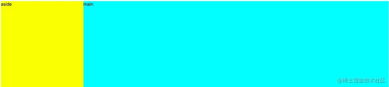
实现两栏布局的方法也有很多,笔者接下来介绍用的比较多的几种方式。
<div class="aside"></div><div class="main"></div>div { height: 500px;}.aside { width: 300px; float: left; background: yellow;}.main { background: aqua; margin-left: 300px;}点击查看代码运行实例
<div class="aside"></div><div class="main"></div>div { height: 500px;}.aside { width: 300px; float: right; background: yellow;}.main { background: aqua; margin-right: 300px;}点击查看代码运行实例
<div class="wrap"> <div class="aside"></div> <div class="main"></div></div>div { height: 500px;}.wrap { position: relative;}.aside { width: 300px; background: yellow; position: absolute;}.main { background: aqua; margin-left: 300px;}点击查看代码运行实例
<div class="wrap"> <div class="aside"></div> <div class="main"></div></div>div { height: 500px;}.wrap { position: relative;}.aside { width: 300px; background: yellow; position: absolute; right: 0;}.main { background: aqua; margin-right: 300px;}点击查看代码运行实例
<div class="wrap"> <div class="aside"></div> <div class="main"></div></div>div { height: 500px;}.wrap { display: flex;}.aside { flex: 0 0 300px; background: yellow; }.main { background: aqua; flex: 1 1;}点击查看代码运行实例
<div class="wrap"> <div class="aside"></div> <div class="main"></div></div> height: 500px;}.wrap { display: grid; grid-template-columns: 300px auto;}.aside { background: yellow; }.main { background: aqua;}点击查看代码运行实例
三栏布局就是两边固定,中间自适应布局,效果如下
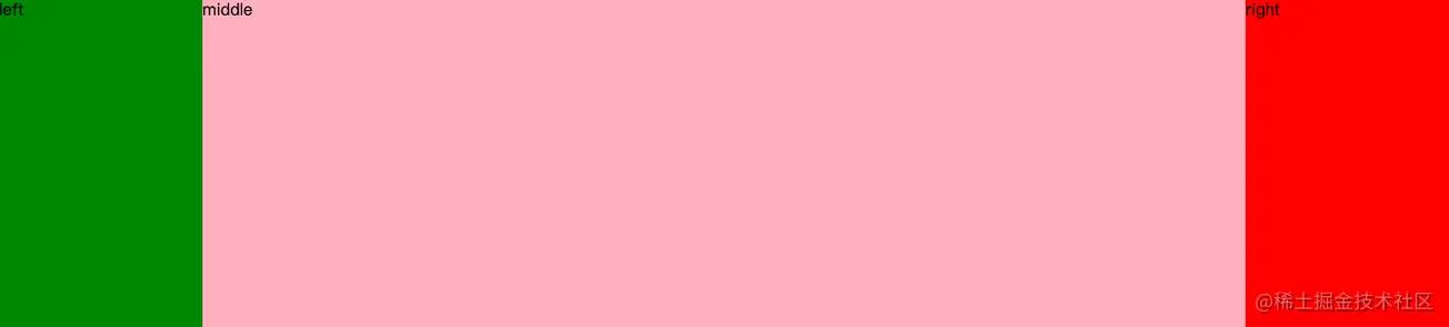
实现三栏布局的方法也有很多,笔者接下来介绍用的比较多的几种方式。
<div class="left"></div><div class="middle"></div><div class="right"></div>html,body { margin: 0;}div { height: 500px;}.left { position: absolute; left: 0; top: 0; width: 200px; background: green;}.right { position: absolute; right: 0; top: 0; width: 200px; background: red;}.middle { margin-left: 200px; margin-right: 200px; background: lightpink;}点击查看代码运行实例
<div class="left"></div><div class="right"></div><div class="middle"></div>html,body { margin: 0;}div { height: 500px;}.left { width: 200px; background: green; float: left;}.right { width: 200px; background: yellow; float: right;}.middle { margin-left: 200px; margin-right: 200px; background: lightpink;}点击查看代码运行实例
<div class="wrap"> <div class="left"></div> <div class="middle"></div> <div class="right"></div></div>html,body { margin: 0;}div { height: 500px;}.wrap { display: flex;}.left { flex: 0 0 200px; background: green;}.right { flex: 0 0 200px; background: yellow;}.middle { background: lightpink; flex: 1 1;}点击查看代码运行实例
<div class="wrap"> <div class="left"></div> <div class="middle"></div> <div class="right"></div></div>html,body { margin: 0;}div { height: 500px;}.wrap { display: grid; grid-template-columns: 200px auto 200px;}.left { background: green;}.right { background: yellow;}.middle { background: lightpink;}点击查看代码运行实例
圣杯布局在项目中基本上不会再使用了,在面试中我们会经常碰到,所以需要了解。
主要用到了浮动和和相对定位。
<div class="container"> <div class="content">中间内容</div> <div class="left">左侧区域</div> <div class="right">右侧区域</div></div>div { height: 500px;}.container { padding: 0 200px 0 200px; border: 1px solid black;}.content { float: left; width: 100%; background: #f00;}.left { width: 200px; background: #0f0; float: left; margin-left: -100%; position: relative; left: -200px;}.right { width: 200px; background: #00f; float: left; margin-left: -200px; position: relative; right: -200px;}点击查看代码运行实例
双飞翼布局在项目中基本上不会再使用了,在面试中我们会经常碰到,所以需要了解。
主要用到了浮动。
<div class="main"> <div class="content">content</div></div><div class="left">left</div><div class="right">right</div>div { height: 500px;}.main { float: left; width: 100%; background: #f00;}.main .content { /* margin、padding这两种方式都可以 */ /* margin-left: 200px; margin-right: 300px; */ padding-left: 200px; padding-right: 300px;}.left { width: 200px; background: #0f0; float: left; margin-left: -100%;}.right { width: 200px; background: #00f; float: left; margin-left: -200px;}点击查看代码运行实例
因为flex和grid布局方法已经很强大了,日常工作中99%的布局都可以使用这两种方式来实现。所以笔者建议能使用flex或者grid布局方法实现的就尽量使用这两种布局方式实现。因为不仅简单而且负面作用也很少。
浮动布局和绝对定位布局会导致元素脱离文档流,会带来一些负面作用,有时会导致一些意想不到的结果。
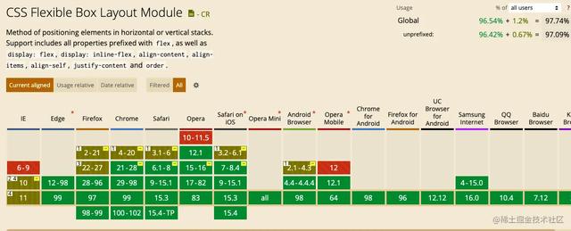
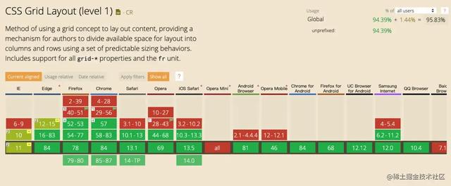
关于flex布局的兼容性和grid布局的兼容性,目前已经支持的很好了,大家可以放心使用。
flex布局的兼容性
grid布局的兼容性
感谢小伙伴们的耐心观看,本文为笔者个人学习笔记,如有谬误,还请告知,万分感谢!如果本文对你有所帮助,还请点个关注点个赞~,您的支持是笔者不断更新的动力!
声明:本站内容部分源于网络转载,出于传递更多信息之目的,并不意味着赞同其观点或证实其描述。文章内容仅供参考,请咨询相关专业人士。
如果无意之中侵犯了您的版权,或有意见、反馈或投诉等情况, 请联系本站,[qq:]
Copyright ©2024 编程密语 All rights reserved 版权所有 鲁ICP备09004228号-12
 鲁公网安备37020202000738号