惊喜!Python开发者的福音已经来临!
发表时间: 2018-10-29 11:16


在之前的一篇文章《Python 数据可视化利器》中,我写了 Bokeh、pyecharts 的用法,但是有一个挺强大的库 Plotly 没写,主要是我看到它的教程都是在 Jupyter Notebooks 中使用,说来也奇怪,硬是找不到如何本地使用(就是本地输出 HTML 文件),所以不敢写出来。现在已经找到方法了,这里我就在原文的基础上增加了 Plotly 的部分教程。
数据可视化的第三方库挺多的,这里我主要推荐两个,分别是 Bokeh、pyecharts。
数据可视化的库有挺多的,这里推荐几个比较常用的:
Plotly 文档地址:
使用方式:
Plotly 有 online 和 offline 两种方式,这里只介绍 offline 的。
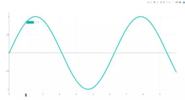
这是 Plotly 官方教程的一部分
import plotly.plotly as pyimport numpy as npdata = [dict( visible=False, line=dict(color='#00CED1', width=6), # 配置线宽和颜色 name=' = ' + str(step), x=np.arange(0, 10, 0.01), # x 轴参数 y=np.sin(step * np.arange(0, 10, 0.01))) for step in np.arange(0, 5, 0.1)] # y 轴参数data[10]['visible'] = Truepy.iplot(data, filename='Single Sine Wave')
只要将最后一行中的
py.iplot
替换为下面代码
py.offline.plot
便可以运行。
漏斗图
这个图代码太长了,就不 po 出来了。

Basic Box Plot
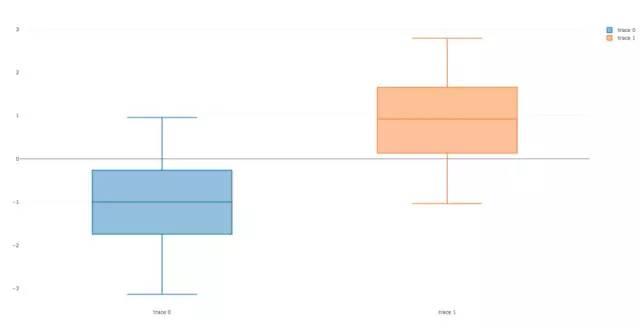
import plotly.plotlyimport plotly.graph_objs as goimport numpy as npy0 = np.random.randn(50)-1y1 = np.random.randn(50)+1trace0 = go.Box( y=y0)trace1 = go.Box( y=y1)data = [trace0, trace1]plotly.offline.plot(data)
Wind Rose Chart

import plotly.graph_objs as gotrace1 = go.Barpolar( r=[77.5, 72.5, 70.0, 45.0, 22.5, 42.5, 40.0, 62.5], text=['North', 'N-E', 'East', 'S-E', 'South', 'S-W', 'West', 'N-W'], name='11-14 m/s', marker=dict( color='rgb(106,81,163)' ))trace2 = go.Barpolar( r=[57.49999999999999, 50.0, 45.0, 35.0, 20.0, 22.5, 37.5, 55.00000000000001], text=['North', 'N-E', 'East', 'S-E', 'South', 'S-W', 'West', 'N-W'], # 鼠标浮动标签文字描述 name='8-11 m/s', marker=dict( color='rgb(158,154,200)' ))trace3 = go.Barpolar( r=[40.0, 30.0, 30.0, 35.0, 7.5, 7.5, 32.5, 40.0], text=['North', 'N-E', 'East', 'S-E', 'South', 'S-W', 'West', 'N-W'], name='5-8 m/s', marker=dict( color='rgb(203,201,226)' ))trace4 = go.Barpolar( r=[20.0, 7.5, 15.0, 22.5, 2.5, 2.5, 12.5, 22.5], text=['North', 'N-E', 'East', 'S-E', 'South', 'S-W', 'West', 'N-W'], name='< 5 m/s', marker=dict( color='rgb(242,240,247)' ))data = [trace1, trace2, trace3, trace4]layout = go.Layout( title='Wind Speed Distribution in Laurel, NE', font=dict( size=16 ), legend=dict( font=dict( size=16 ) ), radialaxis=dict( ticksuffix='%' ), orientation=270)fig = go.Figure(data=data, layout=layout)plotly.offline.plot(fig, filename='polar-area-chart')
Basic Ternary Plot with Markers
篇幅有点长,这里就不 po 代码了。

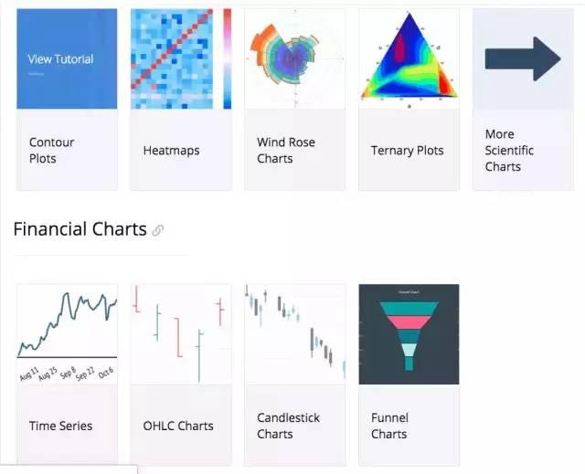
这里展示一下常用的图表和比较抢眼的图表,详细的文档可查看。
条形图
这配色看着还挺舒服的,比 pyecharts 条形图的配色好看一点。
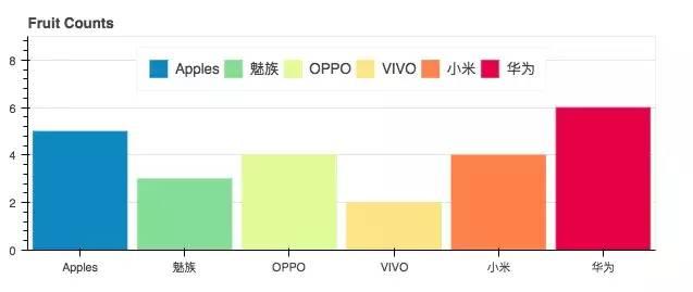
from bokeh.io import show, output_filefrom bokeh.models import ColumnDataSourcefrom bokeh.palettes import Spectral6from bokeh.plotting import figureoutput_file("colormapped_bars.html")# 配置输出文件名fruits = ['Apples', '魅族', 'OPPO', 'VIVO', '小米', '华为'] # 数据counts = [5, 3, 4, 2, 4, 6] # 数据source = ColumnDataSource(data=dict(fruits=fruits, counts=counts, color=Spectral6))p = figure(x_range=fruits, y_range=(0,9), plot_height=250, title="Fruit Counts", toolbar_location=None, tools="")# 条形图配置项p.vbar(x='fruits', top='counts', width=0.9, color='color', legend="fruits", source=source)p.xgrid.grid_line_color = None # 配置网格线颜色p.legend.orientation = "horizontal" # 图表方向为水平方向p.legend.location = "top_center"show(p) # 展示图表年度条形图
可以对比不同时间点的量。

from bokeh.io import show, output_filefrom bokeh.models import ColumnDataSource, FactorRangefrom bokeh.plotting import figureoutput_file("bars.html") # 输出文件名fruits = ['Apple', '魅族', 'OPPO', 'VIVO', '小米', '华为'] # 参数years = ['2015', '2016', '2017'] # 参数data = {'fruits': fruits, '2015': [2, 1, 4, 3, 2, 4], '2016': [5, 3, 3, 2, 4, 6], '2017': [3, 2, 4, 4, 5, 3]}x = [(fruit, year) for fruit in fruits for year in years]counts = sum(zip(data['2015'], data['2016'], data['2017']), ()) source = ColumnDataSource(data=dict(x=x, counts=counts))p = figure(x_range=FactorRange(*x), plot_height=250, title="Fruit Counts by Year", toolbar_location=None, tools="")p.vbar(x='x', top='counts', width=0.9, source=source)p.y_range.start = 0p.x_range.range_padding = 0.1p.xaxis.major_label_orientation = 1p.xgrid.grid_line_color = Noneshow(p)饼图

from collections import Counterfrom math import piimport pandas as pdfrom bokeh.io import output_file, showfrom bokeh.palettes import Category20cfrom bokeh.plotting import figurefrom bokeh.transform import cumsumoutput_file("pie.html")x = Counter({ '中国': 157, '美国': 93, '日本': 89, '巴西': 63, '德国': 44, '印度': 42, '意大利': 40, '澳大利亚': 35, '法国': 31, '西班牙': 29})data = pd.DataFrame.from_dict(dict(x), orient='index').reset_index().rename(index=str, columns={0:'value', 'index':'country'})data['angle'] = data['value']/sum(x.values()) * 2*pidata['color'] = Category20c[len(x)]p = figure(plot_height=350, title="Pie Chart", toolbar_location=None, tools="hover", tooltips="@country: @value")p.wedge(x=0, y=1, radius=0.4, start_angle=cumsum('angle', include_zero=True), end_angle=cumsum('angle'), line_color="white", fill_color='color', legend='country', source=data)p.axis.axis_label=Nonep.axis.visible=Falsep.grid.grid_line_color = Noneshow(p) 条形图

年度水果进出口
from bokeh.io import output_file, showfrom bokeh.models import ColumnDataSourcefrom bokeh.palettes import GnBu3, OrRd3from bokeh.plotting import figureoutput_file("stacked_split.html")fruits = ['Apples', 'Pears', 'Nectarines', 'Plums', 'Grapes', 'Strawberries']years = ["2015", "2016", "2017"]exports = {'fruits': fruits, '2015': [2, 1, 4, 3, 2, 4], '2016': [5, 3, 4, 2, 4, 6], '2017': [3, 2, 4, 4, 5, 3]}imports = {'fruits': fruits, '2015': [-1, 0, -1, -3, -2, -1], '2016': [-2, -1, -3, -1, -2, -2], '2017': [-1, -2, -1, 0, -2, -2]}p = figure(y_range=fruits, plot_height=250, x_range=(-16, 16), title="Fruit import/export, by year", toolbar_location=None)p.hbar_stack(years, y='fruits', height=0.9, color=GnBu3, source=ColumnDataSource(exports), legend=["%s exports" % x for x in years])p.hbar_stack(years, y='fruits', height=0.9, color=OrRd3, source=ColumnDataSource(imports), legend=["%s imports" % x for x in years])p.y_range.range_padding = 0.1p.ygrid.grid_line_color = Nonep.legend.location = "top_left"p.axis.minor_tick_line_color = Nonep.outline_line_color = Noneshow(p)散点图
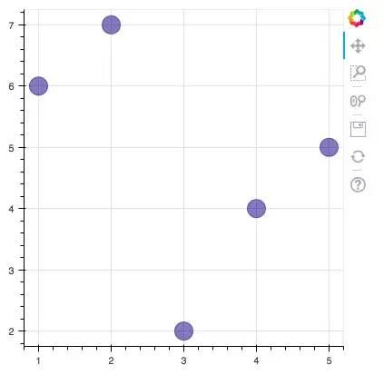
from bokeh.plotting import figure, output_file, showoutput_file("line.html")p = figure(plot_width=400, plot_height=400)p.circle([1, 2, 3, 4, 5], [6, 7, 2, 4, 5], size=20, color="navy", alpha=0.5)show(p)六边形图
这两天,马蜂窝刚被发现数据造假,这不,与马蜂窝应应景。

import numpy as npfrom bokeh.io import output_file, showfrom bokeh.plotting import figurefrom bokeh.util.hex import axial_to_cartesianoutput_file("hex_coords.html")q = np.array([0, 0, 0, -1, -1, 1, 1])r = np.array([0, -1, 1, 0, 1, -1, 0])p = figure(plot_width=400, plot_height=400, toolbar_location=None) # p.grid.visible = False # 配置网格是否可见p.hex_tile(q, r, size=1, fill_color=["firebrick"] * 3 + ["navy"] * 4, line_color="white", alpha=0.5)x, y = axial_to_cartesian(q, r, 1, "pointytop")p.text(x, y, text=["(%d, %d)" % (q, r) for (q, r) in zip(q, r)], text_baseline="middle", text_align="center")show(p)环比条形图
这个实现挺厉害的,看了一眼就吸引了我。我在代码中都做了一些注释,希望对你理解有帮助。注:圆心为正中央,即直角坐标系中标签为(0,0)的地方。

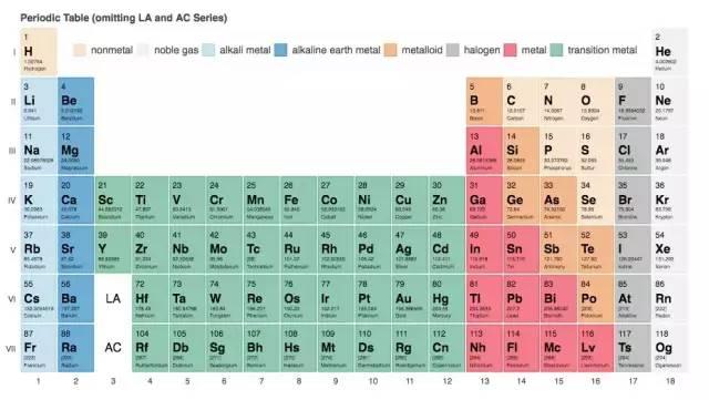
from collections import OrderedDictfrom math import log, sqrtimport numpy as npimport pandas as pdfrom six.moves import cStringIO as StringIOfrom bokeh.plotting import figure, show, output_fileantibiotics = """bacteria, penicillin, streptomycin, neomycin, gram结核分枝杆菌, 800, 5, 2, negative沙门氏菌, 10, 0.8, 0.09, negative变形杆菌, 3, 0.1, 0.1, negative肺炎克雷伯氏菌, 850, 1.2, 1, negative布鲁氏菌, 1, 2, 0.02, negative铜绿假单胞菌, 850, 2, 0.4, negative大肠杆菌, 100, 0.4, 0.1, negative产气杆菌, 870, 1, 1.6, negative白色葡萄球菌, 0.007, 0.1, 0.001, positive溶血性链球菌, 0.001, 14, 10, positive草绿色链球菌, 0.005, 10, 40, positive肺炎双球菌, 0.005, 11, 10, positive"""drug_color = OrderedDict([# 配置中间标签名称与颜色 ("盘尼西林", "#0d3362"), ("链霉素", "#c64737"), ("新霉素", "black"),])gram_color = { "positive": "#aeaeb8", "negative": "#e69584",}# 读取数据df = pd.read_csv(StringIO(antibiotics), skiprows=1, skipinitialspace=True, engine='python')width = 800height = 800inner_radius = 90outer_radius = 300 - 10minr = sqrt(log(.001 * 1E4))maxr = sqrt(log(1000 * 1E4))a = (outer_radius - inner_radius) / (minr - maxr)b = inner_radius - a * maxrdef rad(mic): return a * np.sqrt(np.log(mic * 1E4)) + bbig_angle = 2.0 * np.pi / (len(df) + 1)small_angle = big_angle / 7# 整体配置p = figure(plot_width=width, plot_height=height, title="", x_axis_type=None, y_axis_type=None, x_range=(-420, 420), y_range=(-420, 420), min_border=0, outline_line_color="black", background_fill_color="#f0e1d2")p.xgrid.grid_line_color = Nonep.ygrid.grid_line_color = None# annular wedgesangles = np.pi / 2 - big_angle / 2 - df.index.to_series() * big_angle #计算角度colors = [gram_color[gram] for gram in df.gram] # 配置颜色p.annular_wedge( 0, 0, inner_radius, outer_radius, -big_angle + angles, angles, color=colors,)# small wedgesp.annular_wedge(0, 0, inner_radius, rad(df.penicillin), -big_angle + angles + 5 * small_angle, -big_angle + angles + 6 * small_angle, color=drug_color['盘尼西林'])p.annular_wedge(0, 0, inner_radius, rad(df.streptomycin), -big_angle + angles + 3 * small_angle, -big_angle + angles + 4 * small_angle, color=drug_color['链霉素'])p.annular_wedge(0, 0, inner_radius, rad(df.neomycin), -big_angle + angles + 1 * small_angle, -big_angle + angles + 2 * small_angle, color=drug_color['新霉素'])# 绘制大圆和标签labels = np.power(10.0, np.arange(-3, 4))radii = a * np.sqrt(np.log(labels * 1E4)) + bp.circle(0, 0, radius=radii, fill_color=None, line_color="white")p.text(0, radii[:-1], [str(r) for r in labels[:-1]], text_font_size="8pt", text_align="center", text_baseline="middle")# 半径p.annular_wedge(0, 0, inner_radius - 10, outer_radius + 10, -big_angle + angles, -big_angle + angles, color="black")# 细菌标签xr = radii[0] * np.cos(np.array(-big_angle / 2 + angles))yr = radii[0] * np.sin(np.array(-big_angle / 2 + angles))label_angle = np.array(-big_angle / 2 + angles)label_angle[label_angle < -np.pi / 2] += np.pi # easier to read labels on the left side# 绘制各个细菌的名字p.text(xr, yr, df.bacteria, angle=label_angle, text_font_size="9pt", text_align="center", text_baseline="middle")# 绘制圆形,其中数字分别为 x 轴与 y 轴标签p.circle([-40, -40], [-370, -390], color=list(gram_color.values()), radius=5)# 绘制文字p.text([-30, -30], [-370, -390], text=["Gram-" + gr for gr in gram_color.keys()], text_font_size="7pt", text_align="left", text_baseline="middle")# 绘制矩形,中间标签部分。其中 -40,-40,-40 为三个矩形的 x 轴坐标。18,0,-18 为三个矩形的 y 轴坐标p.rect([-40, -40, -40], [18, 0, -18], width=30, height=13, color=list(drug_color.values()))# 配置中间标签文字、文字大小、文字对齐方式p.text([-15, -15, -15], [18, 0, -18], text=list(drug_color), text_font_size="9pt", text_align="left", text_baseline="middle")output_file("burtin.html", title="burtin.py example")show(p)元素周期表
元素周期表,这个实现好牛逼啊,距离初三刚开始学化学已经很遥远了,想当年我还是化学课代表呢!由于基本用不到化学了,这里就不实现了。

真实状态
pyecharts 也是一个比较常用的数据可视化库,用得也是比较多的了,是百度 Echarts 库的 Python 支持。这里也展示一下常用的图表。
文档地址为:
条形图
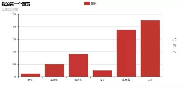
from pyecharts import Barbar = Bar("我的第一个图表", "这里是副标题")bar.add("服装", ["衬衫", "羊毛衫", "雪纺衫", "裤子", "高跟鞋", "袜子"], [5, 20, 36, 10, 75, 90])# bar.print_echarts_options() # 该行只为了打印配置项,方便调试时使用bar.render() # 生成本地 HTML 文件散点图

from pyecharts import Polarimport randomdata_1 = [(10, random.randint(1, 100)) for i in range(300)]data_2 = [(11, random.randint(1, 100)) for i in range(300)]polar = Polar("极坐标系-散点图示例", width=1200, height=600)polar.add("", data_1, type='scatter')polar.add("", data_2, type='scatter')polar.render()饼图
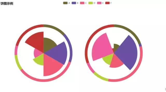
import randomfrom pyecharts import Pieattr = ['A', 'B', 'C', 'D', 'E', 'F']pie = Pie("饼图示例", width=1000, height=600)pie.add( "", attr, [random.randint(0, 100) for _ in range(6)], radius=[50, 55], center=[25, 50], is_random=True,)pie.add( "", attr, [random.randint(20, 100) for _ in range(6)], radius=[0, 45], center=[25, 50], rosetype="area",)pie.add( "", attr, [random.randint(0, 100) for _ in range(6)], radius=[50, 55], center=[65, 50], is_random=True,)pie.add( "", attr, [random.randint(20, 100) for _ in range(6)], radius=[0, 45], center=[65, 50], rosetype="radius",)pie.render()词云
这个是我在前面的文章中用到的图片实例,这里就不 po 具体数据了。

from pyecharts import WordCloudname = ['Sam S Club'] # 词条value = [10000] # 权重wordcloud = WordCloud(width=1300, height=620)wordcloud.add("", name, value, word_size_range=[20, 100])wordcloud.render()树图
这个是我在前面的文章中用到的图片实例,这里就不 po 具体数据了。
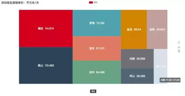
from pyecharts import TreeMapdata = [ # 键值对数据结构 { value: 1212, # 数值 # 子节点 children: [ { # 子节点数值 value: 2323, # 子节点名 name: 'description of this node', children: [...], }, { value: 4545, name: 'description of this node', children: [ { value: 5656, name: 'description of this node', children: [...] }, ... ] } ] }, ... ]treemap = TreeMap(title, width=1200, height=600) # 设置标题与宽高treemap.add("深圳", data, is_label_show=True, label_pos='inside', label_text_size=19)treemap.render()
地图
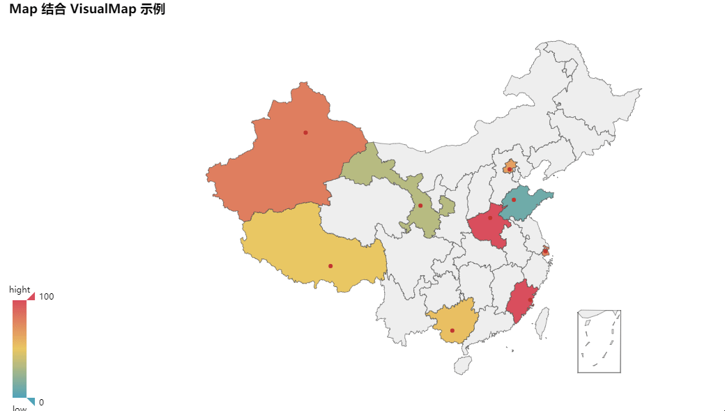
from pyecharts import Mapvalue = [155, 10, 66, 78, 33, 80, 190, 53, 49.6]attr = [ "福建", "山东", "北京", "上海", "甘肃", "新疆", "河南", "广西", "西藏" ]map = Map("Map 结合 VisualMap 示例", width=1200, height=600)map.add( "", attr, value, maptype="china", is_visualmap=True, visual_text_color="#000",)map.render()3D 散点图
from pyecharts import Scatter3Dimport randomdata = [ [random.randint(0, 100), random.randint(0, 100), random.randint(0, 100)] for _ in range(80)]range_color = [ '#313695', '#4575b4', '#74add1', '#abd9e9', '#e0f3f8', '#ffffbf', '#fee090', '#fdae61', '#f46d43', '#d73027', '#a50026']scatter3D = Scatter3D("3D 散点图示例", width=1200, height=600) # 配置宽高scatter3D.add("", data, is_visualmap=True, visual_range_color=range_color) # 设置颜色等scatter3D.render() # 渲染大概介绍就是这样了,三个库的功能都挺强大的,Bokeh 的中文资料会少一点,如果阅读英文有点难度,还是建议使用 pyecharts 就好。总体也不是很难,按照文档来修改数据都能够直接上手使用。主要是多练习。
作者:zone7,一只爱折腾的后端攻城狮,爱写作爱分享。
声明:本文首发于公众号 zone7,作者投稿,版权归对方所有。
“征稿啦”
CSDN 公众号秉持着「与千万技术人共成长」理念,不仅以「极客头条」、「畅言」栏目在第一时间以技术人的独特视角描述技术人关心的行业焦点事件,更有「技术头条」专栏,深度解读行业内的热门技术与场景应用,让所有的开发者紧跟技术潮流,保持警醒的技术嗅觉,对行业趋势、技术有更为全面的认知。
如果你有优质的文章,或是行业热点事件、技术趋势的真知灼见,或是深度的应用实践、场景方案等的新见解,欢迎联系 CSDN 投稿,联系方式:微信(guorui_1118,请备注投稿+姓名+公司职位),邮箱(guorui@csdn.net)。
声明:本站内容部分源于网络转载,出于传递更多信息之目的,并不意味着赞同其观点或证实其描述。文章内容仅供参考,请咨询相关专业人士。
如果无意之中侵犯了您的版权,或有意见、反馈或投诉等情况, 请联系本站,[qq:]
Copyright ©2024 编程密语 All rights reserved 版权所有 鲁ICP备09004228号-12
 鲁公网安备37020202000738号